Manifesto – a public declaration of intentions, opinions, objectives, or motives, asone issued by a government, sovereign, or organisation. – link
For this post I will be researching into 5 manifestos from the given links on the original brief. The aim of this research is to gather an idea of what a manifesto is, how it can be written, and how it can be presented.
Conditional Design
https://conditionaldesign.org/manifesto/
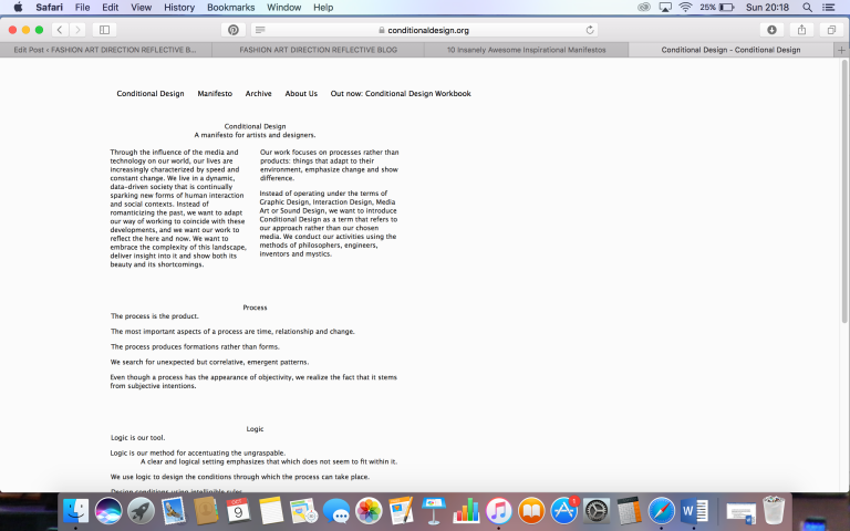
From this web page this specific manifesto is extremely simplistic and straight to the point. As the page doesn’t feature any kind of distractions, it is easy to follow and understand. However the lack of imagery could make the page rather boring and viewers could lose interest.
The Love Magazine.
http://www.thelovemagazine.co.uk/posts/5830/alber-elbaz-lanvin-manifesto-exhibition
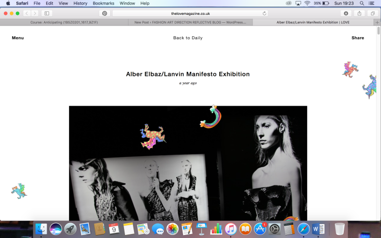
This particular link/manifesto is a lot more creative looking compared to other links in which I have visited. The way the colourful/creative elements fall on screen make the page feel a lot more welcoming and playful, and the way these elements fall help with the flow of of the website. With this manifesto website you are not bombarded with masses of text and images closely packed together, therefore making the website a lot easier on the eye, and easier to remember, and you can focus on each image separately instead of your attention being diverted to anything else. However the negative factor of this website is that there is hardly any text to accompany the images, therefore making it harder to understand the aim/theme of the manifesto.
Apple – “Here’s to the crazy ones”
http://www.1000manifestos.com/apple-crazy-ones/
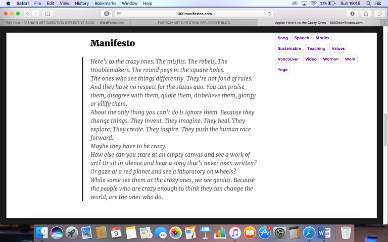
On the 1000 Manifestos website, I was directed to a range of different manifestos. I decided to look at Apple’s manifesto as they are a well known well loved and successful brand. This particular manifesto was really interesting to read as it was more than just a few bullet points, but instead is presented in the form of that similar to a poem. This manifesto of Apple’s is based on positivity, being different and seeing things differently to others. These kinds of themes where reflected through a video in which is featured on the page, as icons such as Martin Luther King and Muhammad Ali. Featuring these clips of icons on the companies video adds a much more visual sense to add more visual power to their manifesto.
Lululemon Manifesto.
http://info.lululemon.com/about/our-story/manifesto?PID=3987228&CID=cj
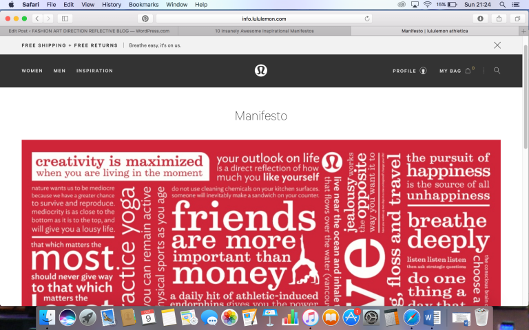
I was instantly drawn to the lululemon athletic wear manifesto due to its mass of text, imagery and bold red colouring. Compared to the manifestos in which I have looked at so far, this manifesto is in the form of a poster. I really like the idea of presenting a manifesto in the form of a poster as it features all the companies “good living” rules in once place, causing the reader to be overwhelmed by positivity. The rules of this manifesto reflects the athletic brand extremely well, as it is all about good living and the mind, just like exercise (athletics).
Ten Principles for good design
https://www.vitsoe.com/gb/about/good-design
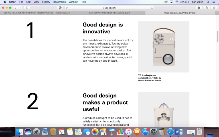
The manifesto discusses a set of rules that help to make good design. The manifesto is set out in a clean and professional manner, possibly reflecting the “good design” theme. The colours/aesthetic featured on this manifesto are very simplistic. When reading the manifesto I noticed that each point starts with “good design…”, therefore reflecting the manifesto idea. Point No. 10 in this manifesto reads “Good design is as little as possible”, and as I have stated this manifesto is rather simplistic, this states that the brand is dedicated to their rules.
